On June 2, we hosted the first public Nexus Face webinar, with 65 people attending.
While discussing why Siebel application is often lagging behind its competitors in usability, we came up with three points:
- Missing user-centricity in design
- Limited amount of UI Components
- Lack of UI Design Patterns for complex user flows
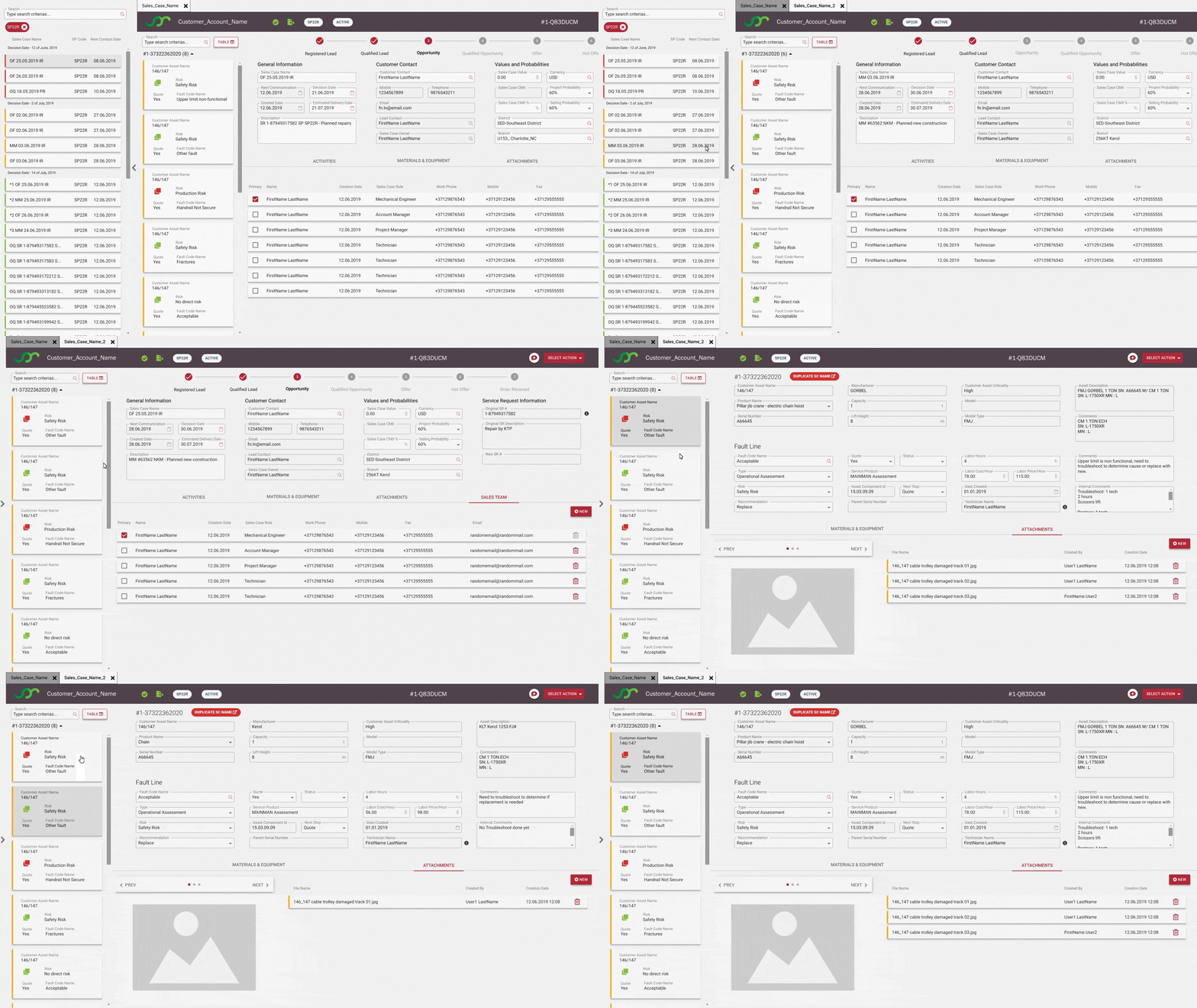
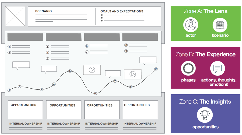
In this article, I would like to familiarize Siebel experts with the main terms, tools, and methods used in the User Experience (UX) domain. To make concepts more tangible, I will explain what UX tools we at Idea Port Riga use during the two-week-long mini-project as we discover Siebel UX improvement opportunities.
For the second year in a row I am leaving San Francisco and Oracle OpenWorld very excited. Last year Oleg and I started to work on the idea, which eventually became the Nexus Bridge for Siebel Open UI. This year I have presented the process for running Siebel UX improvements projects at the Siebel Customers Advisory Board meeting in San Francisco. Nexus Bridge is a crucial technical enabler in Siebel UX projects run by both by Idea Port Riga and several other customers.
This autumn, Idea Port Riga partnered with the Siebelhub team to share our vision about improving Siebel UX with you, the great Siebel community!
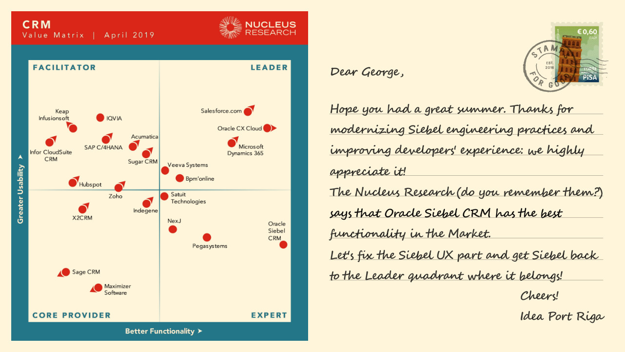
While working on this post, we came across the "CRM Technology Value Matrix 2019" by Nucleus Research. Their verdict that "Siebel CRM has the most breadth of capabilities," yet "the product falls behind in usability," perfectly matches our view on Siebel in 2019.


.png)

