While discussing why Siebel application is often lagging behind its competitors in usability, we came up with three points:
- Missing user-centricity in design
- Limited amount of UI Components
- Lack of UI Design Patterns for complex user flows
#1 Missing user-centricity in design
Historically, Siebel, like any other enterprise employee-facing application, was implemented in the context of a waterfall project culture. Business/system analysts and subject matter experts designed the application's functionality and user interfaces.
In the enterprise environment, we placed the focus on the Siebel Business Components' extension so that enough data fields were available in the UI to support a specific process. We delivered process-centric and 'one size fits any user role' applications to company employees.
Companies organized comprehensive training and wrote hundred-page manuals to teach employees how to find functionality related to their role, which fields to fill, etc. so that users could perform their day-to-day tasks and follow the business process.
On the other side of the fence, successful consumer-facing applications/products tackled their system goals by maintaining continuous discussions and validation with real or potential product users.
User-centric methodologies like Design Thinking (formulated by IDEO and well-described by Tim Brown) framed the project-implementation cycles. Methods described by Alan Cooper, Steve Krug, Jakob Nielsen, Jake Knapp, and other user-focused minds helped to make sure that products or applications did not neglect the target users. They explored user goals, experiences, situations, and environments where actual users would use their products.
These companies made their products so that users could interact with them in an intuitive and hassle-free way making Support teams and manuals essentially redundant.
To change the situation in the enterprise environment, we need to learn about our users before and while executing Siebel projects. Sometimes there is an argument in enterprise UX projects that it's impossible to reach their end-users. The same end-users who even sometimes sit with the project in the same building. This argument seems ridiculous as consumer-facing applications run usability tests with users from another side of the ocean and within a different time zone.
There is also a myth that UX is expensive. You can start small:
- Make sure to involve the User-centric designer in the project planning phase.
- The easiest way could be to check with the company's unit working on your customer-facing applications and ask their UI/UX designer for UX practices to reuse in your Siebel project.
- Book a couple of days and learn about five of your end-users as early as possible.
- And if you're a Business/System analyst, it's time to learn and practice commonly-used UX Research methods:
- Don't start by asking users but rather by making more observations. According to Nielsen Norman Group, Contextual Inquiry is the essential usability study tool, and this makes sense - what people say is not necessarily what they do (sequence, details, etc.).
- Start seeing users’ needs as verbs ( (i.e., goals and end states) instead of nouns that describe solutions.
- Explore and practice more fundamental UX tools such as Usability Testing, Empathy Mapping, Journey mapping, Wireflows, and others.
#2 Limited amount of UI Components
When the approach is legit, the possibility to design and implement a UI is the next issue on the way to a better Siebel user experience.
Modern applications aim for efficient implementation and a coherent UI, and to achieve these goals, we use Design Systems. We can argue that Siebel also has its own "Design System," which is mainly created around Form and List applets and navigating between them.
When designing Siebel UI with out-of-the-box components, we have a pretty simple choice: use a List applet when you need to display a list of items, and otherwise use a Form. Whenever we need column ordering, filtering, or search, it's all there in applets available for us for free.
Admittedly, there are also Tree applets and some other Hierarchy or Timeline applets whose customization is rather complicated.
In addition to the applets, we have a single button type, about five text field types, checkboxes and radio buttons, and a few more input and selection components. The total amount of out-of-the-box UI components is not more than 20.
The split buttons, expansion panels, and other interactive components should be custom-built.
If we look at Siebel's competitors, they provide a much wider choice.
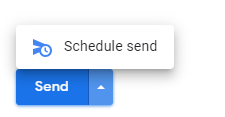
A split button from Gmail allows choosing an alternative email-sending option.
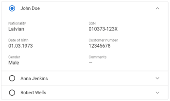
The expansion panel for simple lists with top-aligned labelled fields takes less space.
It is easier to perceive than the ordinary Siebel list and form applets.
It might take sometime before we learn whether Siebel will adopt Oracle's Redwood design system. But already now, you can get inspiration from exploring existing design systems like Material from Google, Lightning from Salesforce, and Carbon from IBM, and let your Siebel designers/analysts that they have more space for creativity to address user needs. It is possible to implement all these modern components in the Siebel Open UI.
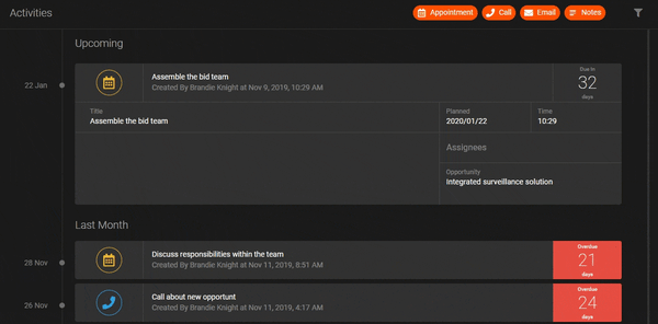
Activities timeline with multi-value fields built in the Siebel Midnight UI using Material Design System components.
#3 Lack of UI Design Patterns for complex user flows
Often enterprise applications need to implement complex user flows and require users to work with large amounts of data. The user tasks, which require analyzing, comparing, and manipulating chunks of data, demand advanced UI functionalities. Despite being good at querying and filtering, out-of-the-box Siebel does not provide layouts and UI patterns commonly used in other applications nowadays. Here are several examples of layouts that we can custom-build in Siebel UI to address complex user flows.
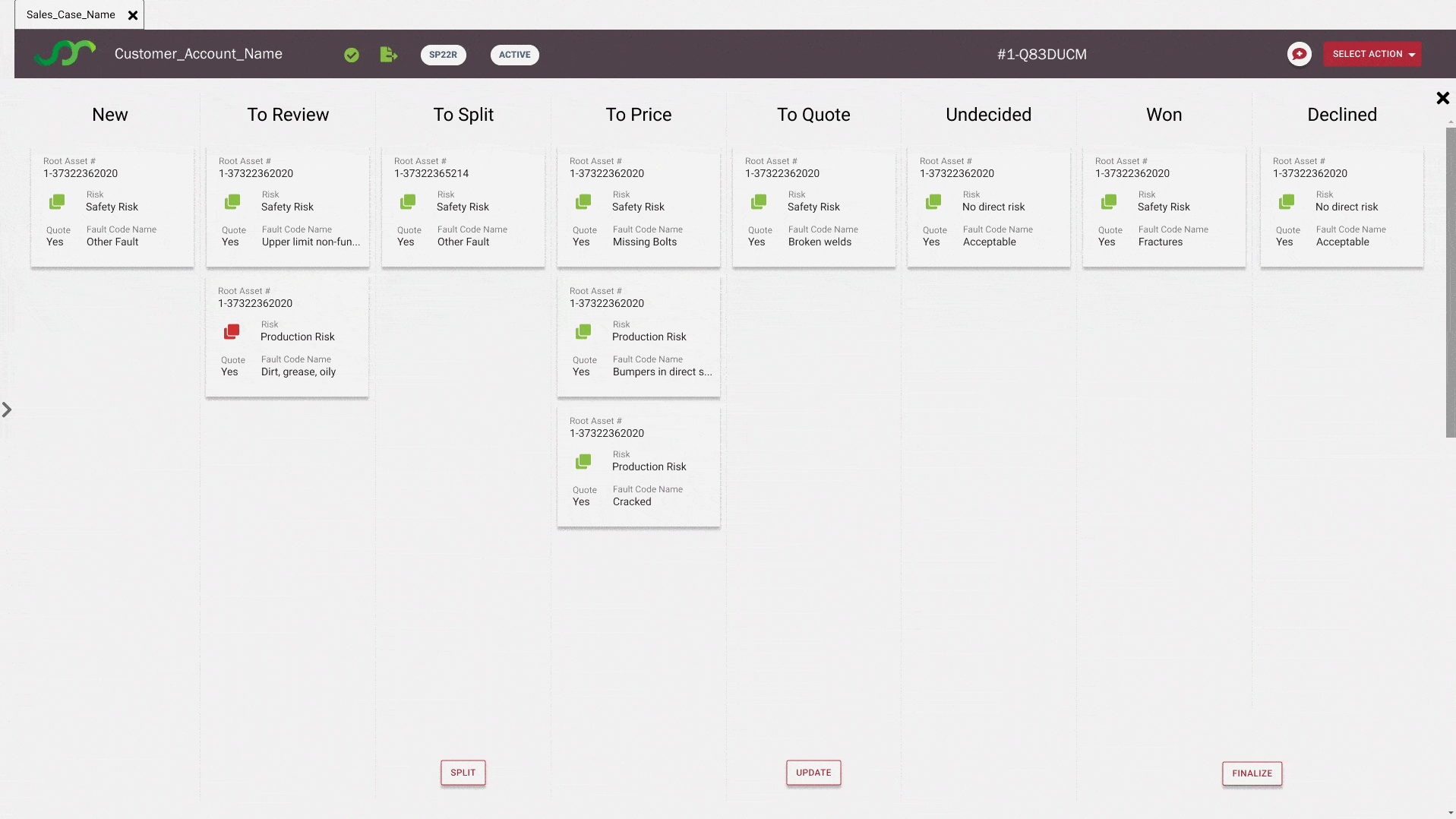
Kanban boards are prized for their simplicity when users aim for a quick overview of the current state of specific data sets. Alternatively, we can use the same boards to organize and prioritize activities in a group of people. We can facilitate these use cases thanks to the ease of dragging and dropping data cards between different "state" columns.
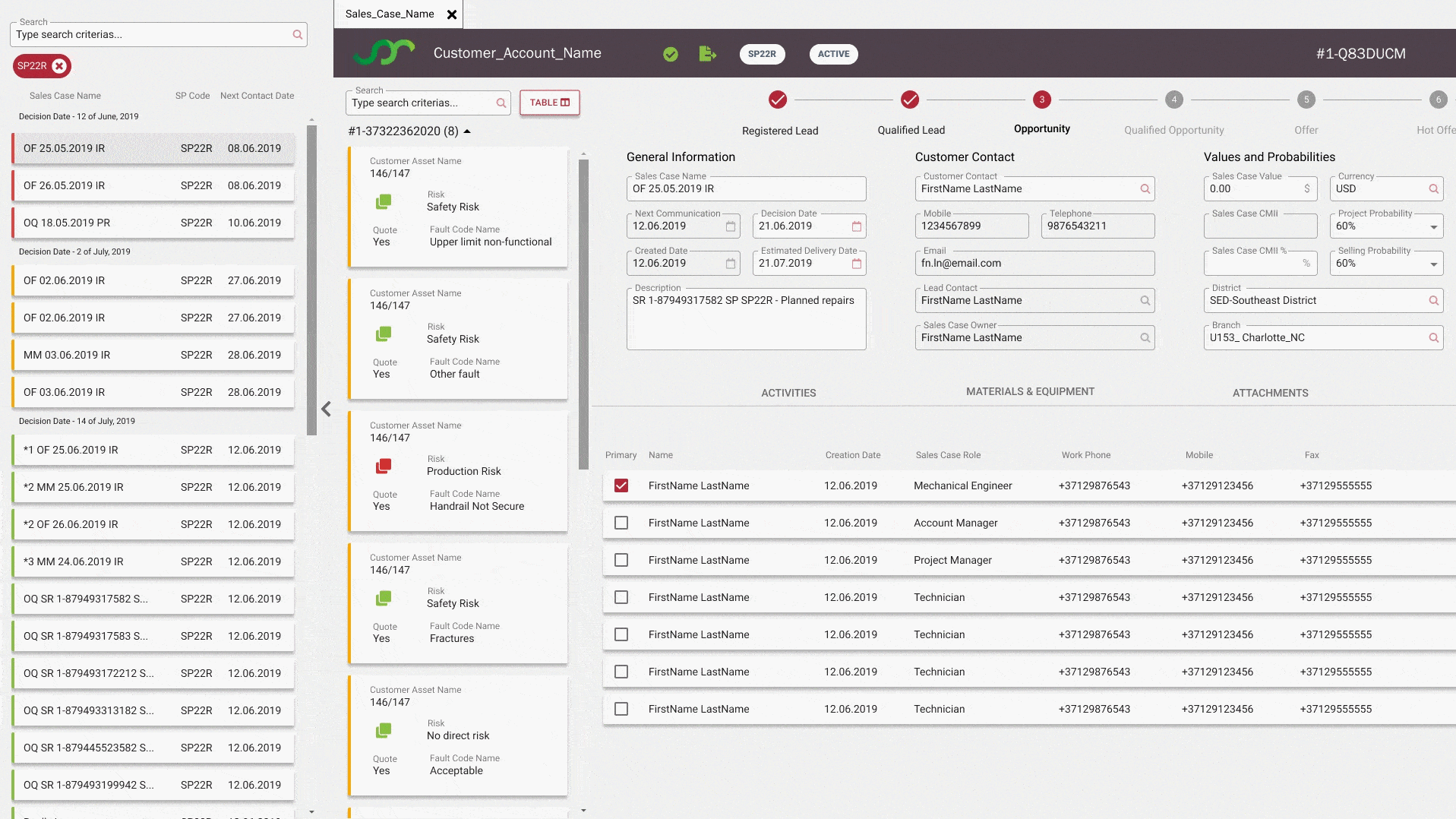
Static Side Panel is another pattern which is quite helpful to:
- always have a specific list to search or switch. Once a user finds a record of her interest - the Side Panel list can be hidden, and the user can dive deep into the record's details.
- at the same time, we can use the Static Side Panel to keep the context unchanged while the user navigates through the Siebel application views. This pattern might come in use when, for example, a user needs to keep some details available at hand to view or enrich.
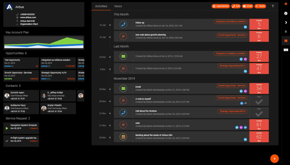
Dashboards. When a user needs to get a quick overview of, for example, a Customer profile, Dashboards are the ones that streamline time-consuming navigation across several sections of customer views and eliminate the need to manually "mine" the data for insights. With the help of configurable dashboards comprised of interactive UI components, we can combine multiple sets of data, while keeping UI clear and easy to understand.
The patterns above are just several examples of what you can achieve when doing UX the right way.
We encourage you to start with simple, pragmatic steps and, over time, achieve remarkable improvements. Get started with your internal team or give us a shout and let's together run a two-week exercise involving certified UX professionals from Ideaport Riga.